|


The DARPA/IAO REMIX (unauthorized)
by David
Goldberg
 The
Department of Defense has finally learned how to use Photoshop along
with Powerpoint. The result is a frightening hybrid of large, bullet-pointed,
sans-serif text and lurid multi-layered backgrounds[1]
born for large scale digital projection in Reston VA hotel ballrooms
and archived in bloated PDF files. Their project logos have evolved
from old-school hand-illustrated ovals with circumscribed totem animals
and lite-Masonic American colonial symbolism (stars, lightning bolts,
arrows) to the quality of late 80's motion video graphics: embossed
chrome letters, specular highlights, transparent extruded forms. Finally
the web face of the Military Industrial Complex has abandoned gray or
white backgrounds, black Times text, and blue links, for the somewhat
more contemporary dynamics of framesets, rollovers, and persistent menu
bars. In short, the .mils and more obscure .govs have undergone the
same process of evolution that pornography sites went through almost
ten years go, including the practice of giving "tours" as an invitation
to membership. The
Department of Defense has finally learned how to use Photoshop along
with Powerpoint. The result is a frightening hybrid of large, bullet-pointed,
sans-serif text and lurid multi-layered backgrounds[1]
born for large scale digital projection in Reston VA hotel ballrooms
and archived in bloated PDF files. Their project logos have evolved
from old-school hand-illustrated ovals with circumscribed totem animals
and lite-Masonic American colonial symbolism (stars, lightning bolts,
arrows) to the quality of late 80's motion video graphics: embossed
chrome letters, specular highlights, transparent extruded forms. Finally
the web face of the Military Industrial Complex has abandoned gray or
white backgrounds, black Times text, and blue links, for the somewhat
more contemporary dynamics of framesets, rollovers, and persistent menu
bars. In short, the .mils and more obscure .govs have undergone the
same process of evolution that pornography sites went through almost
ten years go, including the practice of giving "tours" as an invitation
to membership.
The
masterpiece of this New Pentagon Aesthetic is the oft-changed DARPA
Information Awareness Office website.
Here, drop-shadows and a consistent color pallette present the Defense
Advanced Research Project Agency's latest half-fantasies of power and
domination, this time refracted through the lense of extreme information
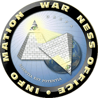
technology. The DARPA/IAO logo brings it all together. An all-seeing
green eye gazing down through its own golden radiace at the top of the
American pyramid and illuminating the "heathen" parts of the globe:
generally the Muslim world from North and East Africa to Southeast Asia.
This part appears to be a collage of clip art and hand illustration
ringed by a Photoshopt polished black chiseled edge with the title of
the office running all the way around in clean, gold, block capitals.
The latin inscription "Scientia Est Potentia" gives the whole thing
a Founding Fathers Revived Roman Empire feel.
 |>click
for larger version<| |>click
for larger version<|
The
IAO logo is rich in depth and posesses a legibility that communicates
to the entire spectrum of viewers from Mindless Patriot Robot ("I feel
so safe now!") to Deeply Paranoid Freak ("I TOLD you so!") to
the Frankly Jaded Bourgeois Visual Critc ("I told you so.").
It is a perfect expressin of Brand Identity. Too bad John Poindexter
and his boys got shook by the power of their own magic and in a politically
superficial move have stripped the site of some of its mystique [2].
Nevertheless, they have left the bulk of their advanced project advertisements
intact, allowing any indivdiual with a web browser to peruse fantastic
projects that will translate spoken language in real time (Babylon and
Communicator), automatically assemble evidence of terrorist behavior
patterns (Genoa and EELD), and basically check out everything that goes
on in the world (Poindexter's own controversial Total Information Awareness
project).
It
is fascinating and a little scary that these project descriptions are
not hidden behind the bureaucratic complexity of a freedom of information
act request. Apparently the Bush 2.0 adminisration's tactics of telling
the "truth" at the beginning of a crisis to avoid future muckracking
("yes, we have a shadow government in place," and "yes, this is going
to be a long war") are being adopted across the entire defense
complex. Government information that was once protected by its sheer
dryness and density is now protected by weird, bold, distracting, and
sometimes laughable visual seductions... like Vegas.
On
the DARPA/IAO site each project is illustrated by a collage that is
somewhere between an actual explanation, a promotional flowchart, and
digital outsider art. Cobbled together from Powerpoint presentations,
these graphics condense multi-million dollar projects into heiroglyphic
fields that are literally overloaded with mixed messages and visualized
fantasies. When the Babylon
project's clip-art Farsi woman and Negro Warfighter speak across a "militarized
PDA" we are reminded more of Get Your War On[3]
than the goals of hardliner military strategists; FutureMap's
dartboard probability graph representing "market-based techniques for
avoiding surprise and predicting future events" is no more comprehensible
than the text descriptions below it (note how program accomplishments
are "to be determined"); while Project
Genisys's "ultra-large, all-source information repositories" are
visualized in terms of primitive arrows, basic geometric shapes, and
text boxes. In many cases, DARPA graphics would give visualization god
Edward R. Tufte a heart attack, but we should probably be
grateful that he was not contracted to do DARPA's graphics. Nevertheless,
many of these graphics do indeed explain what the American Intelligence
Community intends to have at its disposal from here on out. They are
undoubtedly tax-payer financed, ridiculously expensive and more ambitious
(in terms of technology and narrative) than a lot of contemporary science
fiction (though you will find many early cyberpunk prognostications).
This
project, the DARPA/IAO Remix, looks at four DARPA/IAO projects:
Evidence Extraction and Link Discovery (EELD), Human Identity
at a Distance (HumanID), and versions I and II of Project Genoa.
When I first saw the explanatory graphics for these projects I was enamoured
by the bold naivete of their bureaucratic aesthetics. Finally, here
is an American visual tradition that possesses the same weird charm
as the Mexican and Indian urban street graphics that are making their
way into expensive little Phaidon editions. Though Jazz is the Classical
archetype of the "Only Truly American," these digital images are from
the Hip-hop era of sampling and graffiti... here are the chrome arrows,
characters, and text-crowded fields to prove it. Naturally I tried to
click on them as if they were image maps, hoping that such interactivity
would yield elaborations on icons like the woman in the red dress who
operates a lathe at a uranium plant, the sometimes grinning caucasians
getting their faces "recognized," and the "policy makers" and "analysts"
working with the Genoa Projects. The DARPA/IAO Remix implements those
image maps and fleshes out the narratives, explains or comments on the
technological processes behind the faces, and "exposes" those who hide
behind sweeping titles like "policy makers."
As
these visual explanations are already collections of samples, I have
attemped to "mine" them with Public Enemy's Bomb Squad sonic production
strategies as my inspiration. As the user clicks on the project graphics,
windows containing additional imagery (some being image maps themselves)
will pop up, sometimes accompanied by additional text. It should be
noted that all of these images are altered only in terms of size or
cropping, and were found on the internet using their descriptors in
the "source" graphic as search keys. Each image has a link to its actual
source on the net, exclusively in the .mil and .gov domains whenever
possible, but also from DARPA-related .edus and a few serendipitous
links to sites that were totally unrelated to the goals of my search.
I have also added additional commentary to the Program Objective, Program
Strategy, and Planned Accomplishments section of each project; these
comments are in red.
I
have decided to riff on the IAO's original web aesthetics to honor those
anonymous Microsoft Frontpage and Photoshop jockeys that have given
a face to the most intimidating collection of technological proposals
ever seen.
[1] 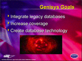 |>img
src<| [from DARPATech2002 presentations, PDF] |>BACK<|
|>img
src<| [from DARPATech2002 presentations, PDF] |>BACK<|
[2] [props to YodArt] See breakyourchains.org,
politechbot,
and the
Electronic Privacy Information Center. |>BACK<|
[3] Check the Get Your War On website.
|>BACK<|
|